Meshify Insights
Shedding light to customers in darkness.
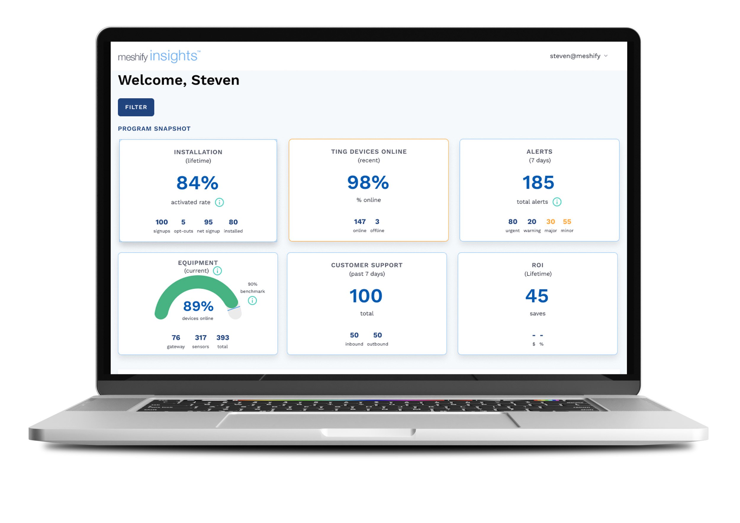
With the launch of the Insights Dashboard, customers could finally view key information on their terms.
Project Stats
Roles & Responsibilities
Lead UX/UI Designer
User research
Iterative wireframing & prototyping
Workshop Leader/Facilitator
Prototyper
Key Collaborators
Product Manager
VP Product
2 FE Devs, 1 BE Dev
Customer Success Lead
110 Labor hours Saved
Insights frees up time for customer service reps. Customers no longer depend on meshify to deliver their reports.
Project Tools
Figma
Pendo
Miro
Airtable
Highcharts
Tara Sager, Client Manager, Jewelers Mutual
“The functionality and interactivity of the Insights dashboard is impressive. It is easy to use and visually appealing. I look forward to exploring the solution further.”
Let’s spill the tea, shall we?
Meshify had groundbreaking technology capable of saving customers thousands or even millions of dollars. However, the data from their sensors, was difficult to interpret.
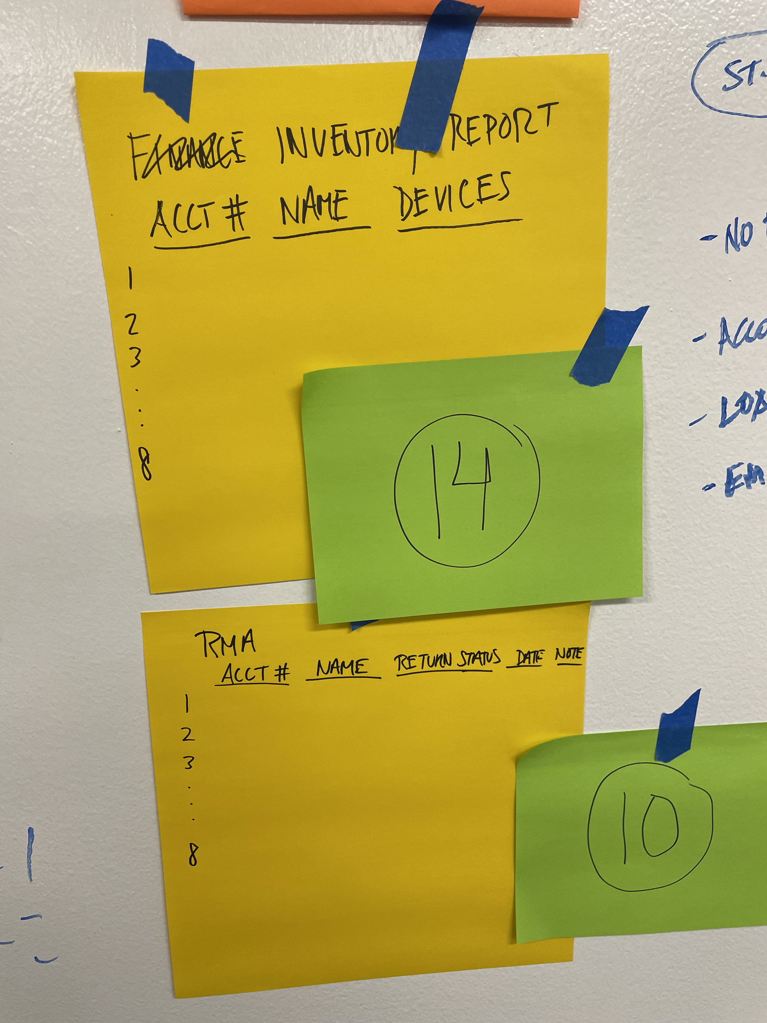
A cumbersome process to decipher the data resulted in a time-consuming, confusing report that needed further deciphering in Excel.
To address these issues, I initiated a “How Might We” exercise, focusing on these key questions:
How might we provide customers with a better way to understand their Sensor Program?
How might we deliver clearer, more meaningful insights into their Sensor Program?
How might we grant customers access to program data and the autonomy to navigate it?
The Nitty Gritty
USER INSIGHTS
Samsonite? I was way off!
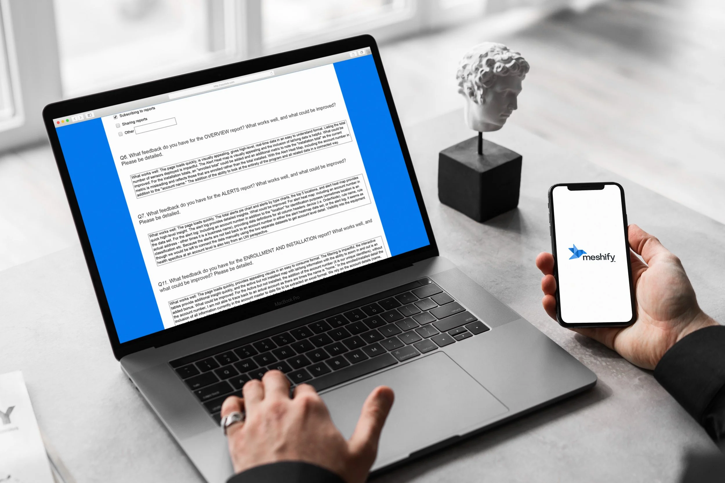
We thought we had a decent foundation for Insights, but knew we needed customer feedback. We contacted 5 of our most active and supportive clients (~30 lucky folks) to enlist their feedback. A small, controlled, launch occurred for these 5 clients only for them to test. With the launch, I included a survey for them to fill out.
The goals of the feedback were:
First impressions
Feature ranks and impressions
Ease of use
Suggestions
What did we actually learn?
Siloed Reports
The original design had each report type as individual pages. This did not allow customers to connect the dots between metrics or understand relationships between events.
Multiple Use Cases / Personas
Feedback revealed 2 additional use cases, at least. The design needed to satisfy both ends of the spectrum: a high level look, a medium , manager type who could get into the details, and the middle ground.
Filtering is Helpful
The ability to filter would make a more customized view of the data. Each client was excited about this feature.
Metrics are unclear
Certain metrics needed more explanation. “What is the calculation to get that number?” “Is that metric a benchmark?“ While the metrics are good to have, details and context would be helpful.
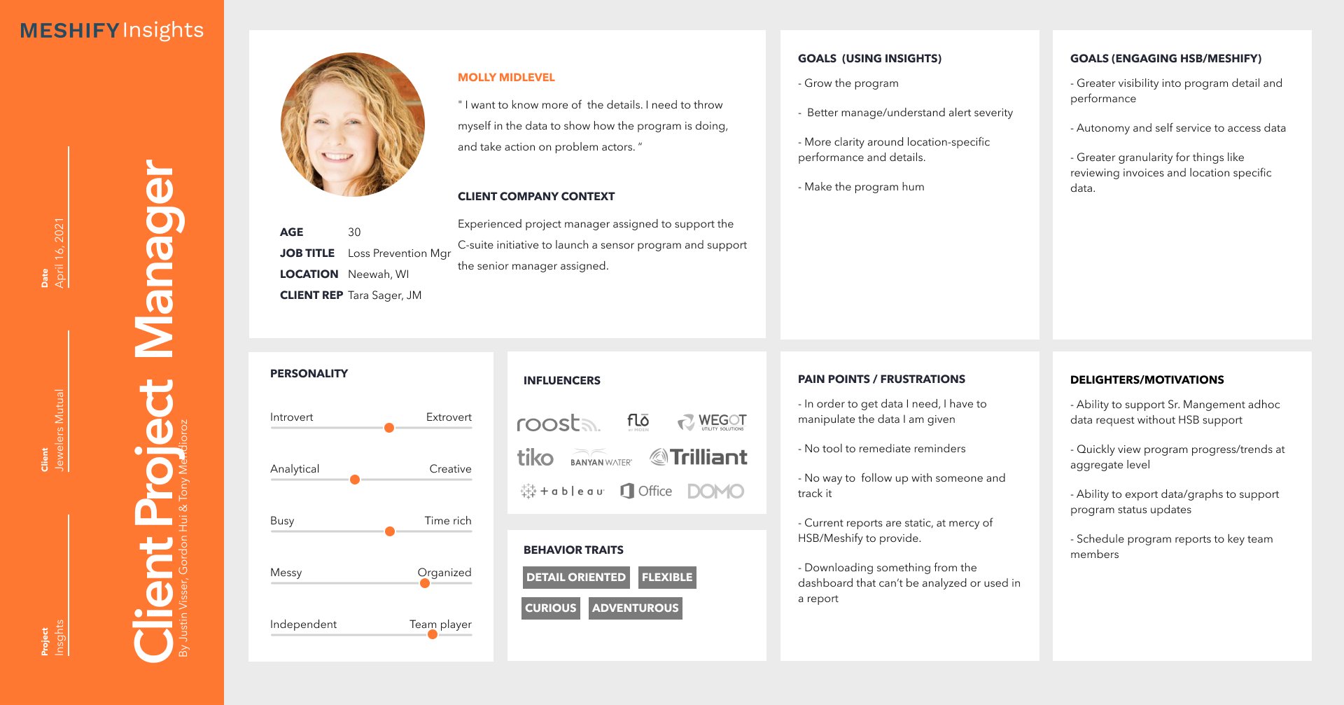
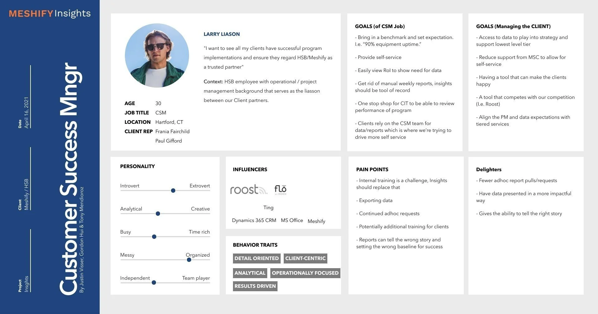
Defining Personas
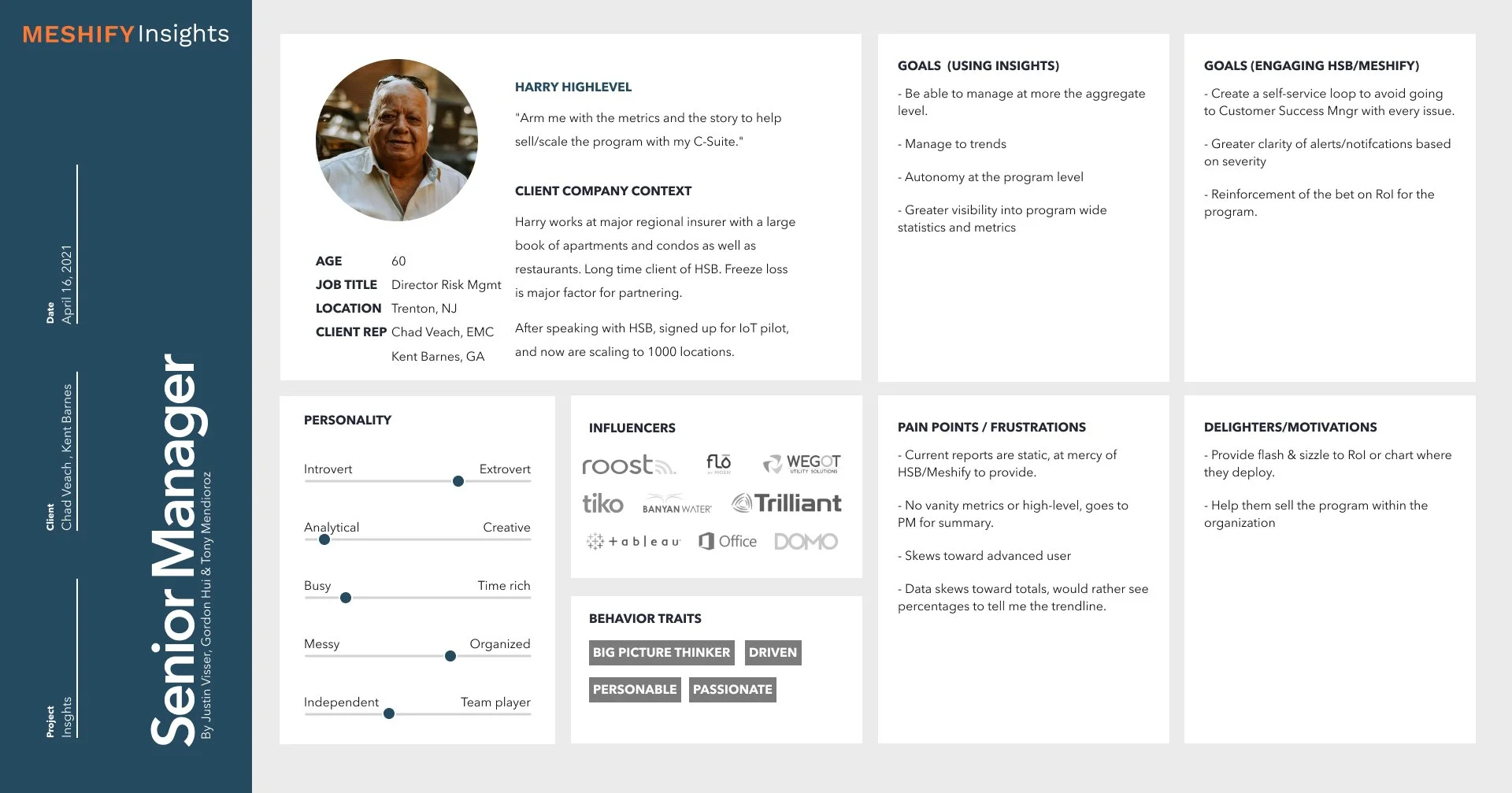
Working with the Client Success Team Lead, I was able to develop new user personas. Justin was crucial in understanding our customers and I learned a great deal from him about customer pain points, goals, usage and expectations. It was determined that there was at least 3 use cases for the product, thus creating 3 personas. The basic breakdown of the personas are as follows:
High-level: Provide the metrics to help sell/scale the program with my C-Suite.”
Mid-level: Wants to know more of the details. throws themselves into the data, take action on problem actors.
Liaison: Wants to see success for clients, implementation and ensure a trusted partnership. (Meshify/HSB employee)
See the full details of the personas below
IDEATE
Back to the Drawing Board
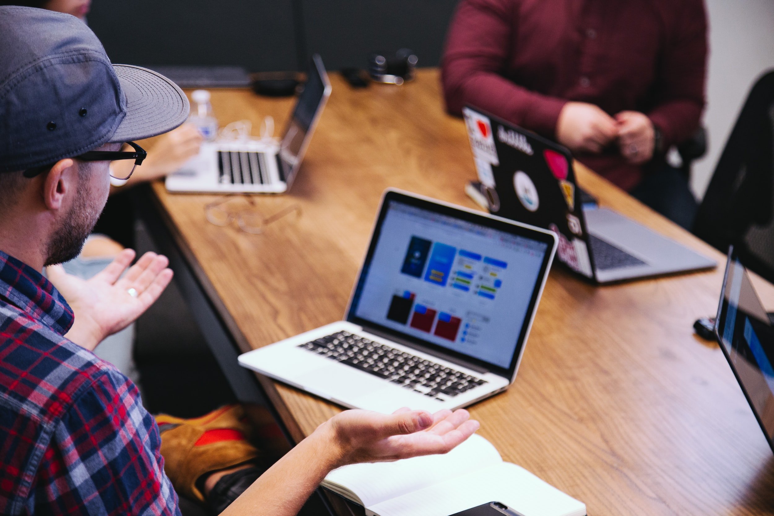
To better understand the problems and goals of the product, and more importantly our users, I led the team on a 3-day workshop in Austin, TX. This included leaders from engineering, product, data science, client success, and design. Goals of the sprint included:
Alignment from Product, Engineering & Customer Success
Identify priorities in regards to data
Layout of product
Workshop Activities
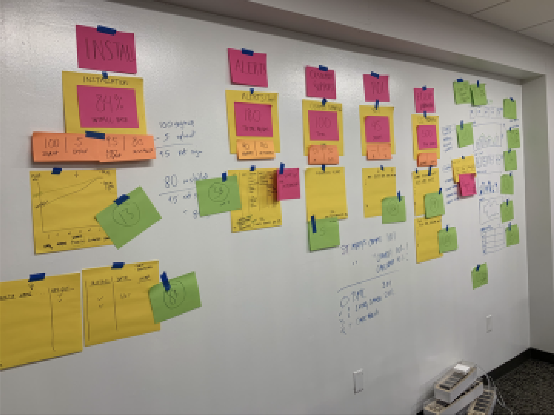
Affinity Diagramming
Based on the input from the feedback sessions, we noted key metrics that clients wanted. We found 5 main categories/groupings. These ultimately became our top KPI Cards.
Sketching & Wireframing
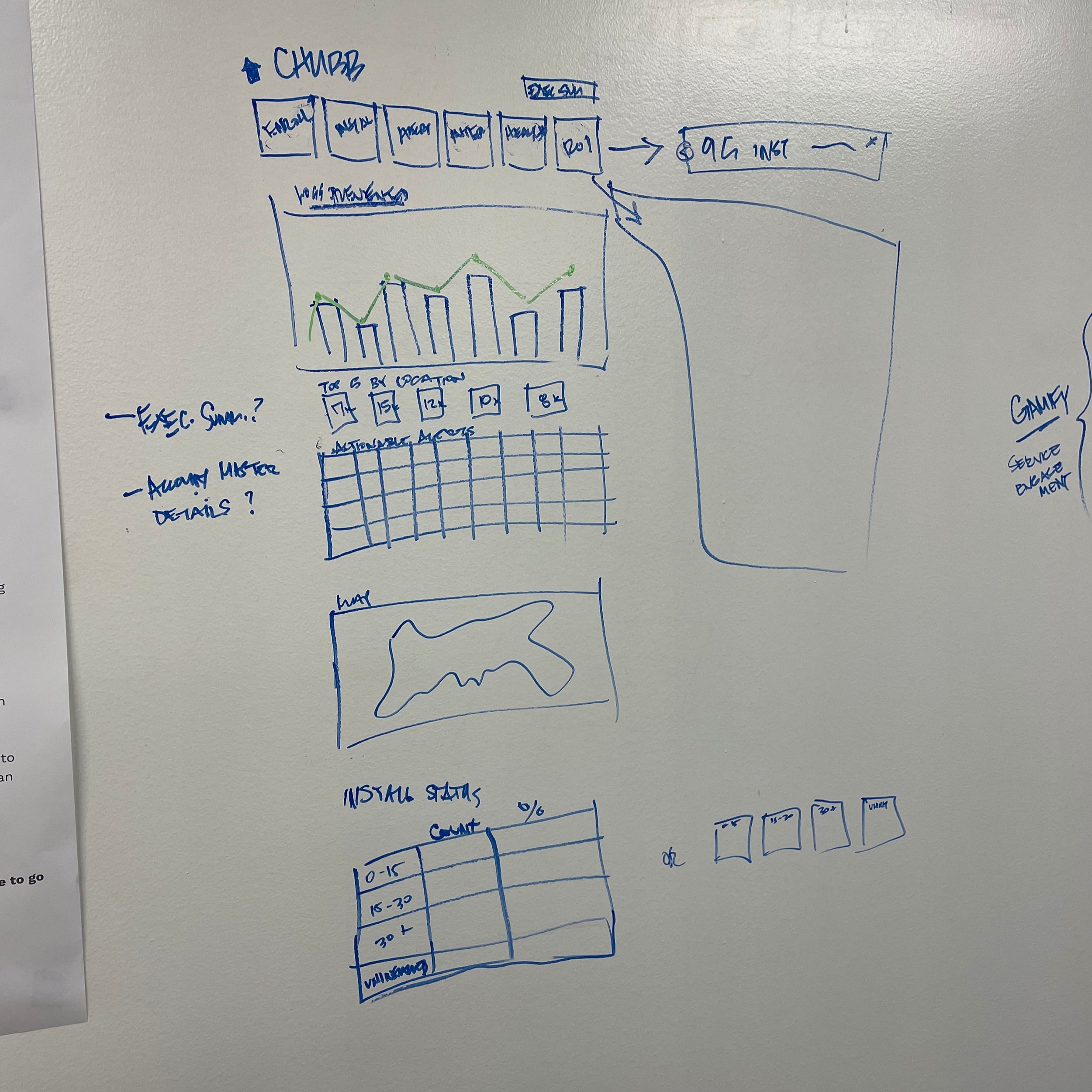
After creating the groupings from the affinity diagramming exercise, I quickly sketched out a few wireframe to give a little shape, layout, and flow.
Forced Ranking
Stakeholders took a vote to determine what the priorities would be for the next iteration.
IDEATE
Workshop Result
With the collaboration of the entire group, the Insights product shaped out to be a Dashboard.
Business Goals
Provide a tool that scales, regardless of client size
Showcase best in class product to attract more customers
Deliver on time, as promised to customers
Technical Goals
Repurpose what we have to best ability
Use Material UI to build quickly that what
Customer Goals
Access to program information 24/7
Get the whole picture of program data
What did the Workshop produce?
Tell the RIGHT Story - Don’t leave out the good parts.
What is the context?
What happens next?
Who are the key actors?
Was it resolved?
Provide perspective - Go wide, then deep
Hit the high notes first
Enable deeper dives if necessary
Let the user decide the depth
Command Center, not a data dump.
Empower to act
Enable helpful functionality
Increase Confidence through Clarity
Provide context
Provide clear, meaningful metrics
Strive for “Of course” not “Wow” moments
Use familiar patterns & elements
Proactive vs. Reactive
Provide context to prepare clients
Eliminate problems before they can appear
Who will benefit most from fixing a problem
LO-FI WIRES
Designing the Dashboard
The workshop provided the framework for the layout and functionality of the dashboard. Key things to consider in this phase were to include:
KPI Cards for high level metrics
Drill down interactions to reveal more details
Downloadable reports and views of the reports
As part of the design implementation, I leveraged Google’s Material UI. These allowed for quick design iterations and satisfied our business goal of shipping on time and being able to scale efficiently. It also helped meet technical goals, enabling the devs to build it quickly and efficiently with a familiar UI package.
dashboard home wireframe (v1)
dashboard drilldown wireframe (v1)
VISUALIZING DATA
Unraveling the Rat’s Nest
With all this data, it was important to choose chart types that would accurately and clearly tell the story. In order to build the charts quickly, the team decided to utilize Highcharts. The decisions for each chart were based on the following:
Customer feedback - goals & requests
Does the chart type tell the desired story for both user and business
Highcharts compatibility/availability
VISUAL DESIGN
Adding Icing to the Cake
Partnering with a visual designer who worked on the rebrand of Meshify, I applied visual styles to the wireframes. I trained her how to create and use styles and components in Figma. This effort allowed for the following objectives to happen:
A quicker application and transition from low to high fidelity
Consistency across Insights
Consistency among other Meshify products.
dashboard home
installation drilldown highlight
Dashboard Screens
PROTOTYPING
Fun with Interaction Design
Due to the sheer volume of data poured into this product there was a need to create more detailed views in the reports. Deeper dives into the data, that would hide and reveal more complex or detailed views. I explored several different ways to include more charts, graphs, and tables within the dashboard for our “Molly Midlevel” persona to dive deep on. Explorations included:
KPI card details
Area Map interactions
Dynamic tables
This design exploration harkens back to the principles of “Go wide, then deep” and “Command Center, not data dump.” This interaction allows clients to have more customized control and a greater view of the story.
Throughout this process I checked in with the FE dev to validate and confirm that my designs were feasible within our timeframe. This collaboration developed some great ideas and allowed us to stay on track for delivery.
prototype of table interaction design explorations
TEST
Evolving through iteration
Throughout this whole process, we remained in close connection with our clients. We also had prioritized features and functionalities from the workshop. I validated those priorities that were force ranked with our clients and slowly built upon the dashboard. Each iteration provided more engagement and a clearer look into the whole story.
Some design elements and features that I designed to be later rolled out include:
Area map upgrades - ability to switch between location data, alert data and a heatmap
Equipment KPI Card - gauge design with benchmark to quickly a status
Additional chart types
area map improvements
What’s Next?
More Testing and Data
Launching is just the beginning. While it was great to have multiple releases, I would love to go back and continue testing, iterating, and diving into data to inform future design decisions. I would explore flows, understand engagement on features and section.
More engagement & interaction.
With more time on this product I would explore ways to take action. The dashboard is great at providing information, but the goal for me would be to then DO something with that info. After seeing a poor read out on equipment, how could I contact a facilities manager to address the situation? Basically do more, be a more interactive tool to help a client manage the full spectrum of the program.
Be proactive
With more time, I would like to explore ways to prepare for or anticipate events. For example, tying in weather data to the area map, could potentially prepare a region for a freeze on the horizon. That weather prediction, could inform me to take preventative action for my equipment.
A smooth sea, never made a skilled sailor
Challenges
Data - immense amounts of data to decipher and synthesize.
Multiple product managers caused gaps in work from time to time.
Growth Development
Working directly with Head of Product
Dev/Design collaboration
Patrick McDonagh - Product Manager, Meshify
“Tony is a rockstar designer who did a great job of taking ambiguous, often-changing requirements and turning them into beautiful, user-friendly UIs. He worked hands-on with the customers/end-users, the internal stakeholders, and the product team to gather feedback and continuously iterate and improve the user experience of our application. He's not only an excellent creative asset, but a conscientious and uplifting team member as well!”
